
Have you ever squinted at a screen? Sometimes text blends into the background. That’s where contrast ratio helps a lot. It is a number that shows how well text or images stand out against their background. This is very important for web accessibility and display technology.
For SaaS companies and digital platforms, getting the right contrast ratio matters. It is not just about looks; it helps everyone read the content, even those with visual problems. Think of it as a link between good design and inclusion.
By following standards like the Web Content Accessibility Guidelines (WCAG), businesses can make user interfaces that look good and follow rules. Whether you change your website’s text color or improve a monitor’s range, knowing contrast ratios helps create inclusive platforms. These platforms work well on different devices and in various lighting conditions.
Let’s learn how this simple number can lead to better digital experiences for all users.
What Is A Contrast Ratio?

The contrast ratio is a way to measure how different two colors are. It is shown as a ratio from 1:1 to 21:1. This ratio helps users see the differences between items on a screen. It is especially important for reading text against its background color.
A higher contrast ratio means there is a bigger difference between the colors. This leads to better readability and makes things easier to use.
In display systems, the contrast ratio is very important. It shows how well the screen can show bright whites and dark blacks. The calculation uses relative luminance values. These values show how bright colors look on a scale from 0 (darkest black) to 1 (brightest white).
Importance of Contrast Ratio
High contrast ratio measurements are important in digital design. They help make content easier to see.
This is especially true for users with color blindness or trouble seeing. Good contrast makes text easy to read. Users do not need extra tools for help. This importance carries over to normal lighting too.
Brightness and screen quality can change how colors look. SaaS platforms gain a lot from good contrast ratios.
These ratios affect both user experience and rules they need to follow. Companies like VH-info see that smart design helps reach more people. It also leads to happier users from different groups.
Formula For Calculating Contrast Ratio
The contrast ratio formula follows a standardized mathematical approach defined by WCAG specifications: (L1 + 0.05) / (L2 + 0.05), where L1 represents the relative luminance of the lighter color and L2 represents the relative luminance of the darker color.
The addition of 0.05 to both values prevents division by zero when dealing with pure black backgrounds and ensures the maximum possible ratio reaches 21:1.
Relative luminance calculations require converting color values through specific mathematical transformations.
For RGB color values, the formula involves: L = 0.2126 R + 0.7152 G + 0.0722 * B, where R, G, and B represent linearized color components. This calculation accounts for human visual perception, weighting green values more heavily than red or blue components.
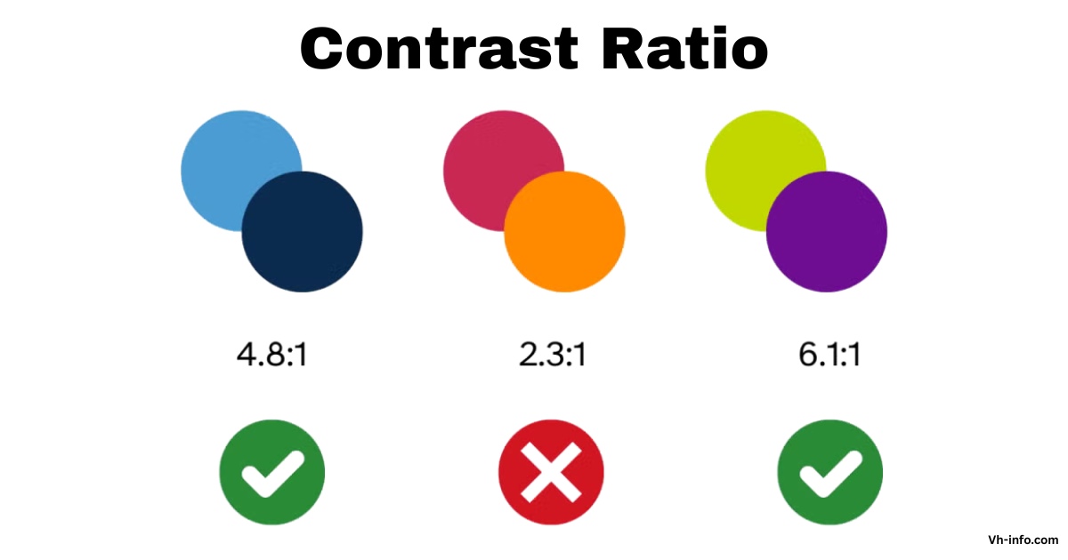
What Is A Good Contrast Ratio?

A good contrast ratio depends on the specific application and accessibility requirements.
For web content, WCAG guidelines establish minimum thresholds that ensure readability across different user groups. The standard considers factors including text size, font weight, and intended audience when determining appropriate contrast levels.
Level AA conformance requires a minimum contrast ratio of 4.5:1 for normal text and 3:1 for large text. These ratios provide sufficient distinction for most users, including those with moderate visual impairments.
For enhanced accessibility, Level AAA standards demand higher ratios of 7:1 for normal text and 4.5:1 for large text. Modern color contrast analyzers and accessibility tools help designers verify these requirements during development.
VH-info emphasizes the importance of testing contrast ratios early in the design process, particularly for SaaS applications where user interface clarity directly affects user adoption and satisfaction.
Contrast Ratio Standards and Guidelines

Web content accessibility guidelines establish comprehensive standards for contrast ratio implementation across digital platforms.
WCAG 2.1 introduces additional requirements for non-text elements, mandating a 3:1 contrast ratio for user interface components and graphics. These standards ensure that interactive elements remain distinguishable from background content.
The success criteria for contrast measurements encompass various content types and presentation contexts.
Level AA compliance serves as the standard requirement for most commercial websites and applications, providing a balanced approach between accessibility and design flexibility. Organizations pursuing Level AAA conformance must meet more stringent requirements, particularly beneficial for platforms serving users with significant visual impairments.
International regulations increasingly include WCAG standards in legal requirements.
The French RGAA 3.0 regulation mirrors WCAG contrast requirements, establishing minimum ratios of 4.5:1 for normal text and 3:1 for enlarged text. These regulatory frameworks highlight the global importance of contrast accessibility in digital content.
Applications of Contrast Ratio in Design

Contrast ratio applications span multiple design disciplines, from web development to graphic design and user interface creation. In web design, proper contrast ensures text readability across different devices and viewing conditions.
SaaS platforms particularly benefit from consistent contrast implementation, as users often access applications under varying lighting conditions and on different display types.
Color accessibility extends beyond basic text and background combinations.
Modern applications must consider contrast in buttons, form elements, icons, and other interactive components. The dynamic range of display systems affects how contrast ratios appear to users, making testing across different devices essential for comprehensive accessibility.
Graphics and data visualization require special attention to contrast ratios, as these elements often convey critical information through color alone. Charts, graphs, and infographic elements must maintain sufficient contrast to ensure information remains accessible to users with color blindness or other visual impairments.
Tools to Test Contrast Ratio

Multiple contrast ratio checker tools provide developers and designers with accessible methods for verifying compliance.
Browser-based tools like Coolors contrast checker offer real-time feedback as designers adjust color values. These tools calculate contrast ratios automatically and indicate whether combinations meet WCAG standards.
WebAIM’s contrast checker provides comprehensive testing capabilities, including support for alpha transparency and RGB hex values.
The tool evaluates both AA and AAA compliance levels, helping teams choose appropriate contrast levels for their specific accessibility goals. Advanced features include color picker functionality for extracting colors directly from existing designs.
Dedicated contrast ratio calculators offer precise mathematical calculations for complex color combinations. These tools prove particularly valuable when working with custom color palettes or when precise luminance calculations are required for specialized applications.
How Is Contrast Ratio Measured?

Contrast ratio measurement starts by finding the brightness of each color in the comparison.
This requires changing color values from their original form, like hex or RGB, into brightness numbers between 0 and 1. The change takes into account gamma correction and how humans see colors.
Tools for professionals use screens that are set up correctly and controlled testing to give precise results. But web development often depends on math calculations that mimic real-life viewing situations. The WCAG formula makes changes for usual viewing setups, including light around that affects how contrast is seen. Monitor specs usually show static and dynamic contrast ratio measurements.
Static contrast ratio looks at brightness differences at the same time. Dynamic contrast ratio checks brightness changes over time. These measurements help users choose displays that are best for accessibility needs.
What is Contrast Finder?

Contrast Finder is a handy tool for web designers and developers. It helps find good color pairs for accessibility rules.
When current color pairs do not meet WCAG standards, Contrast Finder offers new colors. These new colors keep the design looking nice while ensuring they have the right contrast. The tool solves common design problems when chosen colors do not meet accessibility needs.
Instead of trying many options by hand, Contrast Finder quickly finds valid choices. This makes the design work easier while keeping it accessible. This feature is very useful for SaaS companies like VH-info. They need to keep brand colors while also meeting accessibility rules.
Contrast Finder can handle different types of color inputs, such as color names, hex codes, and RGB values. The tool’s system focuses on color choices that look close to the original but still meet contrast needs.
How To Use This Tool?

The Contrast Finder interface consists of five mandatory fields that guide users through the color validation process. The systematic approach ensures comprehensive testing while providing clear feedback about compliance status and suggested improvements.
- Text Color / Foreground: The foreground color field accepts the text color that will appear over the background. This field supports multiple input formats, allowing designers flexibility in specifying colors. The tool provides real-time preview functionality, showing how the specified color appears in the interface.
- Color Keyword: Standard CSS color keywords provide convenient shortcuts for common colors. Examples include “Black,” “Silver,” “YellowGreen,” and “MediumPurple“. These keywords correspond to standardized color values defined in CSS specifications from Level 1 through Level 4.
- Color With RGB values: RGB color specification follows the format RGB(255,255,255) or simplified notation like 255,255,255. This format provides precise control over individual red, green, and blue color components, essential for exact color matching and brand consistency requirements.
- Color With Hexadecimal Values: Hexadecimal color notation uses formats like #AABBCC or abbreviated #ABC. The tool automatically expands abbreviated notation and accepts values with or without the # symbol. Hex values provide web-standard color specification compatible with CSS and HTML implementations.
- Minimum Ratio: Three ratio options correspond to WCAG compliance levels: 3, 4.5, and 7. The choice depends on text size, font weight, and desired accessibility level. Large text (24px) requires a 3:1 ratio for AA compliance, while normal text demands 4.5:1. AAA compliance increases these requirements to 4.5:1 and 7:1, respectively.
- Background Color: The background color field functions identically to the foreground color input, supporting the same range of input formats. This color serves as the base against which the text color contrast is measured.
- Text Size Understanding: Text size categories determine appropriate contrast ratio requirements. Large text, defined as 24px normal weight or 19px bold weight, requires lower contrast ratios than normal text. These specifications align with WCAG definitions that consider both pixel size and font weight in accessibility calculations.
- All Details About The Contrast Ratio: The tool provides comprehensive feedback, including the calculated contrast ratio, compliance status for different WCAG levels, and specific recommendations for improvement. This detailed output helps designers make informed decisions about color combinations while maintaining brand consistency and accessibility requirements.
Disclaimer and Additional Info
Contrast ratio calculations are important for following the rules about accessibility. They help to ensure that designs are easy to use.
However, designers need to think about other things too. These factors can change how easy a design is to read in real life.
For example, font choice matters. Background patterns also play a role. Additionally, animated effects can make text harder to see. All these elements affect readability more than just contrast measurements do.
Required Contrast Ratios For WCAG Conformance
WCAG conformance levels establish minimum standards for different accessibility requirements.
These levels provide structured approaches to accessibility implementation, allowing organizations to choose appropriate compliance targets based on their user needs and regulatory requirements.
- Level AA – Text: Level AA compliance requires a 4.5:1 contrast ratio for normal text and 3:1 for large text. Large text specifications include 18pt (typically 24px) regular weight or 14pt (typically 18.66px) bold weight text. These requirements serve as standard benchmarks for most commercial websites and applications.
- Level AA – Non-Text: Non-text elements including user interface components and graphics require 3:1 contrast ratio under Level AA standards. This requirement ensures that buttons, form controls, and informational graphics remain distinguishable from background elements for users with visual impairments.
- Level AAA – Text: Level AAA standards demand a 7:1 contrast ratio for normal text and a 4.5:1 for large text. These enhanced requirements provide maximum accessibility for users with significant visual impairments but may limit design flexibility in some applications.
Conclusion
Contrast ratio is key for good digital design. It provides rules to make content easy to read for all users. A clear method for checking contrast ratios helps designers and builders make sure their work is open to everyone. They can also keep the look nice and match their brand.
Companies like VH-info do well by using contrast tests in their work processes. Good contrast ratios help with user experience and meet legal needs. They also help products reach a wider audience.
As rules for accessibility change, knowing about contrast ratios is very important for making great digital sites. The tools and rules in this guide give clear steps to use effective contrast methods. Simple calculators and better color checkers help teams confirm they are meeting standards while keeping the design nice. Regular checks make sure that accessibility is part of the design from the start, not just added later.
New tech and changing rules will keep updating contrast needs. Keeping up with WCAG changes and new best practices helps ensure that digital products are accessible while giving great user experiences for all kinds of users and devices.


 VH Info
  Share
Share
 Guest Author