In the competitive SaaS landscape, competitor comparison landing pages are a powerful tool to attract potential customers and drive conversions. These pages allow SaaS companies to highlight their unique features, address pain points, and position their product as the superior choice.
Using comparison tables, customer testimonials, and strategic content can significantly boost organic traffic and improve your search engine optimization (SEO) efforts.
This guide will break down everything you need to know about creating impactful competitor comparison landing pages.
What is a Competitor Comparison Landing Page?
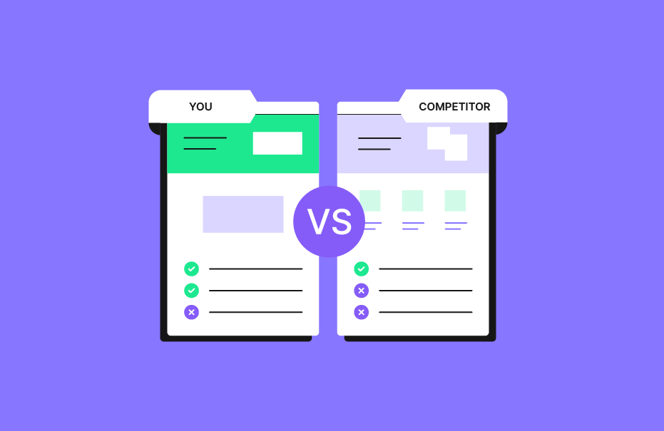
A competitor comparison landing page is a dedicated web page that provides a direct comparison between your product and your competitors’ offerings. These pages aim to help potential buyers make informed decisions by showcasing the key differences in features, pricing, and benefits. They often include elements like a feature comparison table, pricing breakdowns, and user testimonials, making it easier for visitors to evaluate your product against others.
Essential Elements of a Competitor Comparison Landing Page

Feature Comparisons
A feature comparison is the backbone of any competitor comparison landing page. It highlights the key features of your product alongside your competitor’s product, helping potential buyers see the advantages of your SaaS solution.
Using a feature comparison table ensures clarity and makes it easy for visitors to identify how your product addresses their pain points better.
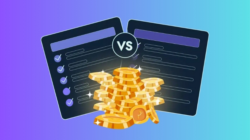
Pricing Breakdown
A transparent pricing breakdown is essential to address budget-related concerns.
Showing a clear comparison of costs, along with what’s included at each price point, helps customers understand the value of your product. This approach also positions your SaaS solution as the best choice for cost-conscious buyers.
Customer Testimonials
Including customer testimonials on your comparison page builds trust and provides strong social proof. Real feedback from satisfied users reassures potential customers, showing how others have benefited from your product.
This is especially impactful when paired with case studies or a high team member satisfaction score.
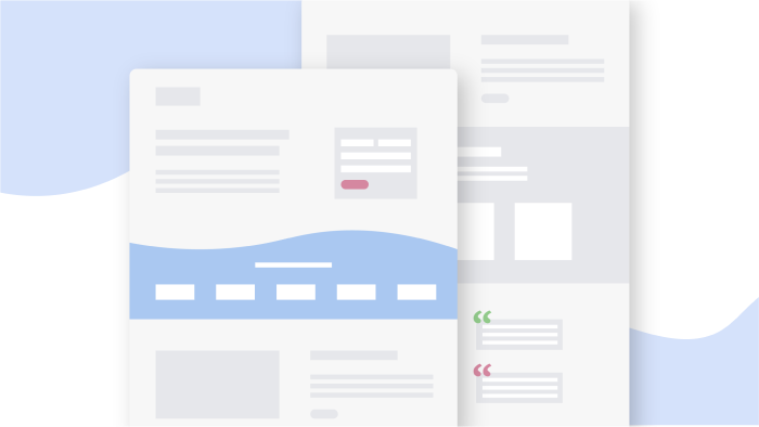
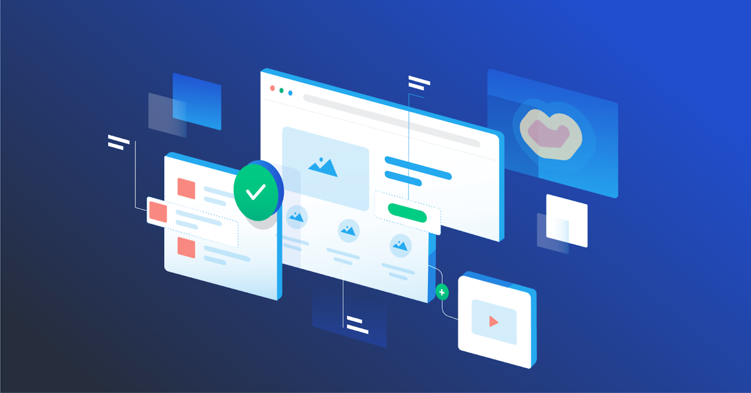
Visuals and Charts
Engaging visuals like graphs, icons, and charts make complex data easier to digest.
A well-designed comparison chart enhances the overall user experience, helping visitors quickly grasp the differences between products. These design features also improve the page’s readability and keep visitors engaged.
Why Competitor Comparison Landing Pages Matter For B2B?
Control the Narrative
A competitor comparison landing page allows you to shape how your product is perceived in the market.
Highlighting your strengths and addressing common objections helps you take control of the conversation. This ensures that visitors see why your SaaS product is the superior choice.
Improve SEO
These pages are a great way to target high-intent keywords like “best [product category” or “[competitor name alternatives.”
Optimizing them for relevant keywords helps improve your rankings on search engines, driving more targeted traffic to your site and boosting organic search performance.
Additionally, using professional services like SaaS Link Building Service can further enhance your SEO strategy by building high-quality backlinks that improve domain authority and organic visibility.
Address Objections
Many customers hesitate because they have unanswered questions or doubts about pricing, features, or usability. A well-structured comparison landing page directly addresses these concerns, helping visitors feel confident in choosing your SaaS solution over a competitor’s product.
Provide Objective Information
Offering balanced, factual comparisons builds credibility with your audience. A fair assessment that includes both strengths and limitations makes it easier for potential buyers to trust your brand and see the value in choosing your product.
Differentiate Your Product
A competitor comparison page is an opportunity to show what sets you apart from major brands or other SaaS companies in your niche. Whether it’s unique features, better customer support, or competitive pricing, these pages highlight why you’re the best product for their needs.
Who Are Competitor Comparison Landing Pages For?

These pages are ideal for:
- SaaS companies targeting specific niches.
- Businesses looking to attract high-intent traffic.
- Teams aiming to convert undecided leads into paying customers.
- Companies seeking to position themselves as an alternative to major brands in their industry.
How to Create an Effective Competitor Comparison Landing Page?
Creating a landing page that compares competitors and gets good results requires careful planning. Follow these steps:
Identifying Key Competitors
Start by identifying which competitors are most relevant to your target audience. Focus on those offering similar SaaS products or targeting the same use cases. Understanding your competitors’ strengths and weaknesses helps you create a comparison landing page that highlights your competitive advantage.
Conducting Keyword Research
Use tools like Google Keyword Planner to find relevant keywords with high search volume, such as “[Competitor Name vs [Your Brand Name.” Targeting these keywords ensures your page aligns with user search intent, helping it rank higher in organic search and attract the right potential customers. For startups looking to refine their SEO strategy, resources like SEO for Startup provide actionable insights and tailored approaches to optimize keyword targeting and drive sustainable growth.
Structuring Your Content
Organize your content so it’s easy to read and navigate. Start with a concise headline, introduce the purpose of the page, and use a clear comparison table to highlight the key differences between products. End with a strong call-to-action, like encouraging visitors to sign up for a free trial or contact customer support for more details.
What to Avoid When Building Competitor Comparison Pages?
Competitor comparison pages can be great for attracting potential customers.
However, there are some things you should avoid to make them really work.
Remember – It’s Not About You
Focus on solving the customer’s problems rather than just promoting your product. Address their pain points and provide useful information that helps them make an informed decision. Avoid making the page feel like a sales pitch.
Trashing the Competition is a No-Go
Avoid criticizing or badmouthing your competitors. Instead, focus on showcasing your product as the best choice by emphasizing its unique features, strong customer support, and better value. A professional tone builds trust with your audience.
Low-Quality Pages – Avoid ’em
A poorly designed or incomplete page can harm your credibility. Ensure your page includes high-quality content, clear visuals like a comparison chart, and accurate information. A well-created page improves the overall user experience and boosts your conversion rate.
No Internal Linking
Failing to include internal links is a missed opportunity to guide visitors to other important pages, like case studies, an FAQ section, or related blog posts. Internal linking improves navigation, keeps visitors on your site longer, and supports your overall digital marketing strategies.
Not Creating Them At All
Not having a competitor comparison landing page means you’re missing out on valuable traffic from users searching for comparisons online. These pages are a great way to attract high-intent visitors, address their objections, and position your SaaS solution as the superior choice in the market.
Tips For Designing a Conversion-Driven Competitor Comparison Landing Page
Pick the Comparison Content Properly
Focus on the most important aspects that matter to your potential customers, such as key features, pricing, and customer support. Avoid overwhelming visitors with unnecessary details. Highlighting the right content ensures your comparison landing page addresses their pain points effectively.
Including a Competitor Comparison Table
A well-organized competitor comparison table is essential for clarity. It allows visitors to quickly see the key differences between your product and your competitor’s product. Use this table to emphasize your unique features and why your product is the best choice for their needs.
Utilize the Right Social Proof
Include customer testimonials, case studies, or awards to build trust and credibility. This social proof reassures visitors that others have benefited from your product, making it easier for them to see it as the superior choice.
Address the Right Questions
Answer the most common questions your audience might have, such as pricing, ease of use, or support options. Addressing these concerns directly on your page helps reduce doubts and improves your conversion rate by guiding visitors toward their next step.
Create Multiple Comparison Pages
If you have multiple competitors, create separate pages tailored to each one. This approach allows you to target specific search intent and relevant keywords, improving your search engine optimization (SEO) and attracting more targeted traffic.
Do It Advertorial Style
Present your content in an informative yet persuasive tone that feels helpful rather than pushy.
Use clear visuals like a comparison chart, concise headlines, and actionable language to guide visitors toward making a decision—whether it’s signing up for a free trial or exploring more about your SaaS product.
Competitor Comparison Page Examples

Example #1: Gusto
Gusto’s competitor comparison landing pages are simple yet highly effective. They include comparison tables that highlight key features and pricing differences between Gusto and competitors like ADP.
The tables are designed with clean visuals, alternating row colors, and collapsible headings to make the content easy to digest.
Gusto also uses tooltips to provide additional details without cluttering the page, ensuring a smooth user experience. These pages are optimized for search intent, helping Gusto attract potential customers looking for HR software comparisons.
Their clear structure and transparency make them a great way to drive conversions.
Example #2: Podia
Podia excels in creating a hub of comparison landing pages, each targeting specific competitors like Teachable or Gumroad.
These pages use tailored comparison tables to emphasize Podia’s strengths, such as no transaction fees and an all-in-one platform for online courses. Each page includes targeted customer testimonials from users who switched from competitors, reinforcing strong social proof.
Podia also engages visitors with interactive elements like pop-up questions to start conversations about their needs. This strategy not only addresses customer pain points but also converts visitors into trial users at an impressive rate of over 10%.
Their approach is a prime example of how SaaS companies can use digital marketing strategies to stand out.
FAQ’s:
Why Should I Create a Competitor Comparison Landing Page?
A competitor comparison landing page helps you attract potential buyers who are actively searching for alternatives to your competitors. It allows you to highlight your unique features, address customer pain points, and position your product as the best choice. These pages also improve your conversion rate by providing clear, actionable information.
How Do I Choose Which Competitors to Compare?
Focus on competitors that target the same audience or offer similar SaaS products. Look at major brands in your niche or those with high search volume for comparison-related keywords. Choosing the right competitors ensures your page aligns with user search intent and attracts the most relevant traffic.
How Often Should Competitor Comparison Pages Be Updated?
Update your comparison landing pages regularly—at least every 3-6 months or whenever there are changes in features, pricing, or market trends. Keeping the content fresh ensures accuracy, improves user experience, and helps maintain strong rankings in organic search.
Can Competitor Comparison Pages Improve SEO Rankings?
Yes, these pages are optimized for high-intent keywords like “[Competitor Name vs [Your Brand Name,” which helps them rank well on search engines. Targeting relevant keywords and providing valuable information helps drive more organic traffic and improve your overall search engine optimization (SEO) strategy.
Conclusion
Competitor comparison landing pages are a great way to attract potential customers, address their pain points, and position your SaaS product as the superior choice.
These pages combine elements like comparison tables, customer testimonials, and clear visuals to create a compelling and informative experience.
When done right, these pages help you control the narrative, differentiate your product, and guide visitors toward their next step, such as signing up for a free trial.
Avoid common mistakes like low-quality content or trashing competitors, and focus on providing balanced, objective information.
At VH Info, we believe that well-created competitor comparison landing pages are an essential part of any successful SaaS marketing strategy, helping you build trust and drive conversions effectively.

 Share
Share