SaaS website best practices are essential for companies looking to stand out in a competitive digital landscape. A well-designed SaaS website can significantly impact user experience, conversion rates, and overall business success.
In this comprehensive guide, we’ll explore key strategies and elements that make up an effective SaaS website, helping you optimize your online presence and drive growth.
Why You Need to Know SaaS Website Best Practices?

- Competitive Advantage: Implementing SaaS website best practices gives you an edge over competitors. A well-optimized website can attract more potential customers and increase conversions, ultimately boosting your market share.
- Better User Experience (UX): A user-friendly website design enhances the customer journey, reducing bounce rates and increasing engagement. This leads to higher customer satisfaction and loyalty.
- Productive Website Architecture: An efficient site architecture improves navigation, search engine rankings, and organic traffic. It also helps ideal customers find the information they need quickly, increasing the likelihood of conversions.
Which Elements Should You Include in Your SaaS Website?

- Homepage: Your home page is the first impression visitors get of your SaaS product. It should communicate your value proposition and guide users to take action.
- Feature & Benefit Page: Highlight the key features and benefits of your SaaS product, addressing pain points and showcasing how it solves problems for your target audience.
- Pricing Page: A well-designed pricing page is important for conversion. It should be transparent, easy to understand, and highlight the value of each plan.
- Why Us & Origin Story: Share your company’s background and unique selling points to build trust and connect with potential customers increasing demand generation.
- Contact Us Page: Make it easy for visitors to get in touch with your sales team or customer support. Include multiple contact options and clear contact information.
- Resources Section: Provide valuable content through blog posts, case studies, and whitepapers to establish your expertise and support your content strategy.
SaaS Website Best Practices to Boost Conversion Rate
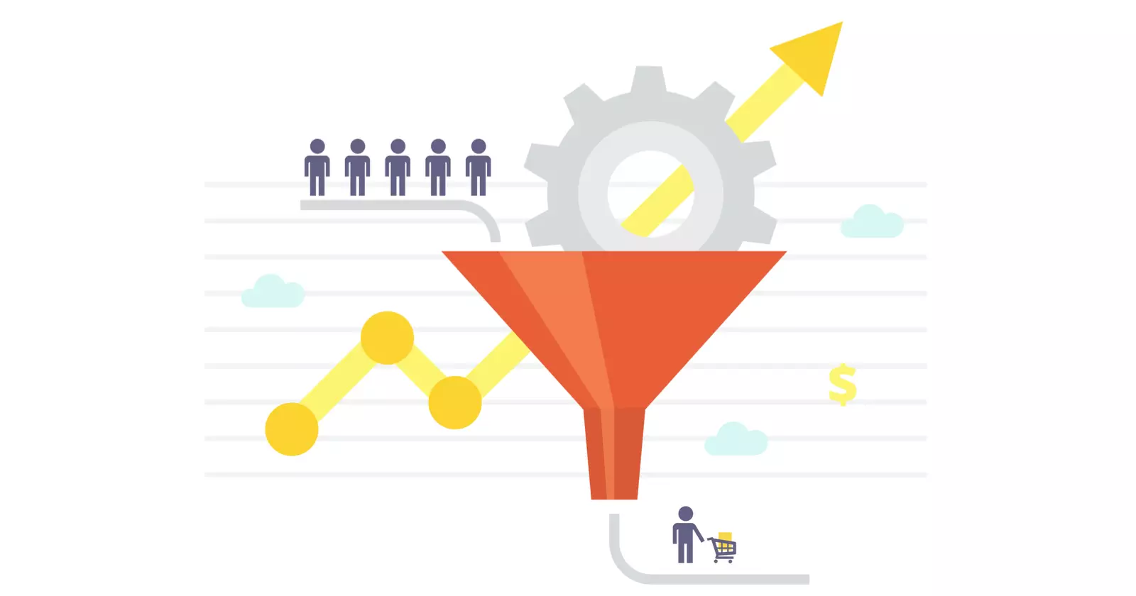
To make your SaaS website more effective, you should do more than just the basics. Using conversion rate optimization (CRO) tactics can greatly help you turn regular website visitors into paying customers.
Here are some important strategies you can use on your site. These can raise your conversion rate and help you get the most out of your SaaS website.
- Discover Your Value Proposition: Clearly communicate the unique benefits of your SaaS product and how it solves your target audience’s pain points.
- Frame Your User as the Hero: Focus on how your product empowers users to achieve their goals, rather than solely promoting your company.
- Experiment With Trial Alternatives: Consider offering alternatives to traditional free trials, such as freemium models or money-back guarantees.
- Embrace Testing and Experimentation: Continuously test and optimize your website elements using A/B testing and data analytics to improve conversion rates.
- Design a User-Friendly Experience: Create an intuitive interface that makes it easy for users to navigate and find the information they need.
- Focus on User Flow and Navigation: Optimize your site architecture to guide visitors through the customer journey smoothly.
- Show the Product: Use screenshots, videos, or interactive demos to give potential customers a deeper understanding of your SaaS product.
Homepage Best Practices

Your SaaS homepage is usually the first thing people notice when they come to your website. It’s very important to create an exciting top section. This can help make a good first impression on visitors and encourage them to stay longer.
Let’s look at some important homepage tips that can Change how visitors view your brand and product.
- Above the Fold Content: Place your most important information and call-to-action (CTA) above the fold to capture visitors’ attention immediately.
- Clear Value Proposition: Communicate your unique selling points concisely and effectively.
- Compelling Call-to-Action: Use action-oriented language and strategically place CTAs to encourage conversions.
- Social Proof Elements: Include customer testimonials, case studies, and success stories to build trust and credibility.
Navigation Best Practices

A good website navigation is key for a positive user experience. Your site’s navigation should be easy to use. It needs to help visitors find the information they want quickly.
Here are some best practices for SaaS navigation to help visitors use your website easily.
- Intuitive Menu Structure: Create a logical and easy-to-use navigation menu that helps users find what they’re looking for quickly.
- Prominent Contact and Demo CTAs: Make it easy for potential customers to request a demo or contact your sales team.
Product Page Best Practices
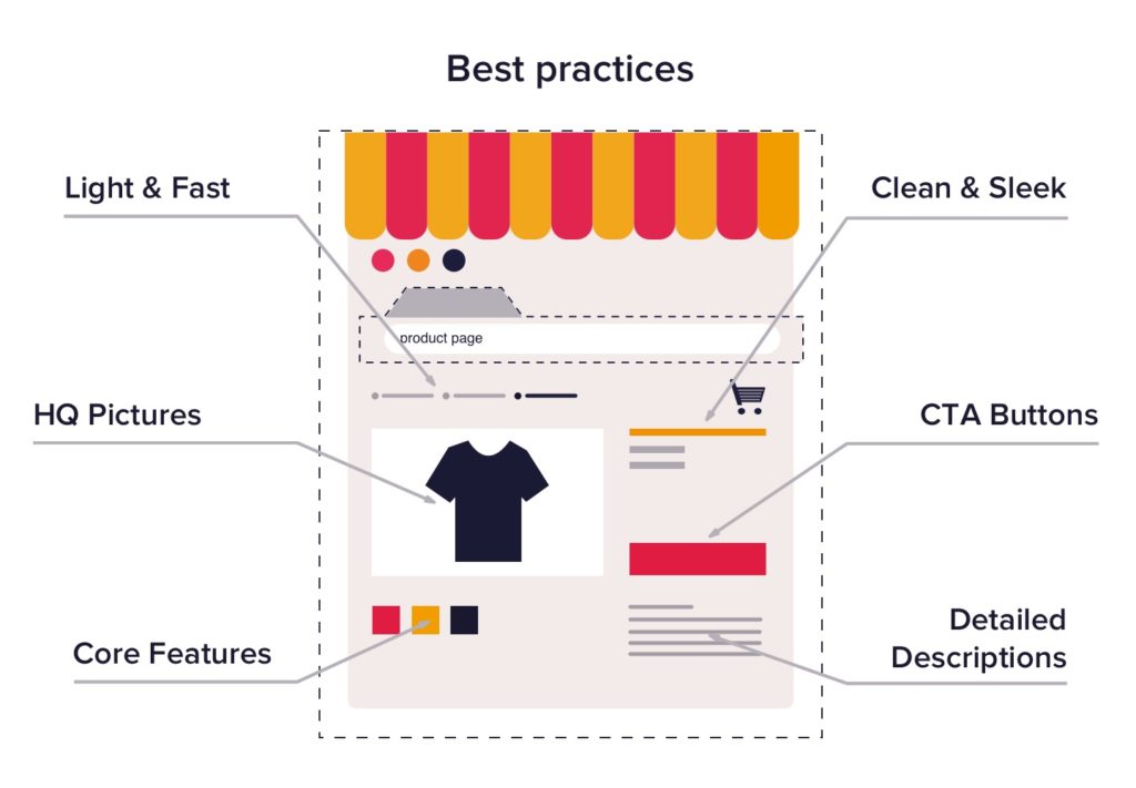
Your SaaS product page is the place where potential customers can find out more about what you offer. It shows them how it can help them. Creating a clear and engaging product page is very important for turning interest into sales.
Here are some key best practices for your SaaS product page to remember.
- Highlight Key Features and Benefits: Communicate how your SaaS product solves problems and delivers value.
- Include Engaging Visuals: Use high-quality images, videos, and infographics to showcase your product’s features.
- Provide Clear Pricing Information: Display transparent pricing information and highlight the value of each plan.
Resources Section Best Practices

Your resources section gives important information to both new and current customers. It is a great way to show your knowledge, build trust, and bring in more website visitors through organic search.
To make your resources section work better, focus on making high-quality content that meets the needs of your target audience.
- Informative Blog Content: Publish valuable, SEO-optimized content that addresses your target audience’s pain points and interests.
- Comprehensive Knowledge Base: Create a searchable repository of helpful articles and guides for users.
- Useful Case Studies and Whitepapers: Showcase real-world examples of how your SaaS product has helped customers succeed.
FAQ Page Best Practices

An FAQ page is very important for any good SaaS website. It acts as a central place to answer common questions from customers. This gives people quick and easy access to useful information.
A good FAQ page can make the user experience better. It can help reduce customer support requests and improve the overall function of your website.
- Address Common Customer Questions: Anticipate and answer frequently asked questions to reduce support inquiries.
- Organize Content into Categories: Group-related questions for easy navigation.
- Include a Search Function: Allow users to quickly find answers to their specific questions.
- Keep Answers Concise and Clear: Provide straightforward, easy-to-understand responses.
Conversion Optimization Best Practices
Conversion rate optimization, or CRO, is very important for getting the best results from your SaaS website. It means improving different parts of your site to help visitors take the actions you want. This could be signing up for a free trial or buying something.
Let’s look at some effective best practices for CRO on SaaS websites.
- Strategically Placed CTAs: Include clear and compelling calls to action throughout your website.
- Optimized Landing Pages: Create targeted landing pages for specific campaigns or user segments.
- A/B Testing Key Elements: Continuously test and refine your website elements to improve conversion rates.
Mobile Responsiveness Best Practices

In today’s world, your SaaS website must do more than just look good on a desktop. It needs to work well on all devices. Mobile responsiveness is important. This feature helps your website adjust easily to various screen sizes.
As a result, people can read your content easily. Images look good too, and navigating your site is just as simple on a mobile phone as it is on a bigger screen.
- Responsive Design Across Devices: Ensure your website looks and functions well on all screen sizes.
- Fast Loading Speeds: Optimize your website’s performance for quick loading on mobile devices.
- Easy Touch-Based Navigation: Design navigation elements that are easy to use on touchscreens.
Analytics and Tracking Best Practices
![]()
Set up conversion tracking to see how well your SaaS marketing campaigns are working. Check important metrics and KPIs often to evaluate your SaaS website’s performance.
- Set Up Conversion Tracking: Use tools like Google Analytics to monitor key conversion metrics.
- Monitor Key Metrics and KPIs: Track important performance indicators to gauge your website’s effectiveness.
- Use Data to Inform Optimizations: Make data-driven decisions to continuously improve your website.
Are You Using These Best Practices On Your SaaS Website?
Take a critical look at your current SaaS website and identify areas for improvement based on these best practices. Implementing these strategies can lead to significant improvements in user experience, conversion rates, and overall business success.
What Are Some Examples of Effective SaaS Websites?

- Dropbox: Dropbox’s website effectively communicates its value proposition and features a clean, user-friendly design.
- Slack: Slack’s website showcases its product features through engaging visuals and clear messaging.
- HubSpot: HubSpot’s website offers a wealth of resources and clear navigation, making it easy for users to find information.
- Mailchimp: Mailchimp’s website features a strong value proposition and intuitive user flow.
- Asana: Asana’s website effectively demonstrates its product’s capabilities through interactive elements and clear messaging.
FAQ’s:
What Are Some Common Design Mistakes to Avoid in SaaS Websites?
Common mistakes include cluttered layouts, unclear value propositions, and poor navigation. Focus on simplicity, clarity, and user-centered design.
How Can I Ensure My SaaS Website is Mobile-Friendly?
Use responsive design techniques, optimize images and content for mobile devices, and test your website across various screen sizes.
How Can I Include Social Proof Effectively Into My SaaS Website Design?
Include customer testimonials, case studies, and success stories throughout your website. Use real names, photos, and specific results to build credibility.
Conclusion
Implementing these SaaS website best practices can significantly improve your online presence, user experience, and conversion rates.
By focusing on clear communication, user-friendly design, and continuous optimization, you can create a website that effectively showcases your SaaS product and drives business growth.
Remember to regularly review and update your website to stay ahead in the competitive SaaS companies landscape.
