Imagine you’re using a new fitness app for the first time. As you complete the setup, you select your fitness goals with a simple tap. Each selection is met by a gentle vibration and a visually pleasing checkmark, confirming your choices. This seamless interaction makes the setup process enjoyable and intuitively guides you through configuring the app without feeling confused or overwhelmed.
This scenario shows how microinteractions, although seemingly minor elements in the broader landscape of user interface design, can profoundly influence the user experience. These subtle design elements are powerful tools that, when effectively implemented, improve user interactions with digital products and services. This, in turn, increases user satisfaction and retention.
In this article, we’ll cover:
- What is user interface and its foundational elements
- What are microinteractions and their key components
- Some microinteraction examples that can improve user experience
- Microinteractions best practices
What is user experience design?
User experience (UX) design is the process of creating products, services, or systems that provide meaningful, engaging, and relevant user experiences. It involves designing the entire process of acquiring and integrating the product, including aspects of branding, design, usability, and function.
Many people think UX design is just about making a product look fancy. While this is part of the process, good UX design is more about making a product that users can easily navigate without having to contact customer service or read too many help docs. In web design, this means creating intuitive layouts and clear pathways that guide users effortlessly toward their goals. Partnering with professional web design services can ensure the creation of user-friendly layouts and optimal pathways, enhancing the overall user experience.
The goal is to enhance customer satisfaction and loyalty by improving the ease of use, efficiency, and pleasure provided during their interaction with the product.
Foundational elements of good user experience design
Here are some core components of good UX design:
- User research. This is crucial to understanding users’ needs, motivations, and behaviors. You can conduct user research through interviews, surveys, and usability testing. These provide insights into what users want and need from a product, allowing UX designers to create more effective and tailored user experiences.
- Design thinking. This is an iterative process that design teams use to understand their users, redefine problems, challenge assumptions, and create innovative solutions to prototype and test. It usually involves five phases: empathize, define, ideate, prototype, and test. This helps teams tackle problems that are ill-defined or unknown.
- Usability. This is about making products functional and easy to use. It focuses on helping users achieve their goals effectively and efficiently in a specified context of use. Usability testing, therefore, is an essential tool to gauge how user-friendly a product is.
- Information architecture (IA): IA involves designing information environments to facilitate usability and navigability. It’s about organizing information in a way that’s easy to understand and find, e.g. structuring a website or app to ensure that users can easily navigate and find the content they need.
- Interaction design (IxD). This focuses on creating engaging interactive systems with well-thought-out behaviors. IxD considers how a user interacts with a system, including the aesthetics and motion of interface elements, responsiveness of the system, and the overall feeling a user experiences during the interaction.
- Visual design. Visual design improves a product’s aesthetic appeal and usability with appropriate images, typography, space, layout, and color. It enhances a product by engaging users and helping to communicate the overall message and brand. In the realm of computer vision software development, this design approach is crucial for ensuring that visual elements are not only attractive but also interpretable by algorithms, thereby bridging the gap between aesthetics and functionality.
- Accessibility. A critical aspect of UX design is ensuring accessibility to people with disabilities in all products, which can range from visual and hearing impairments to physical and cognitive conditions. Accessibility means designing products that can be used by all people to the greatest extent possible without the need for adaptation.
- Prototyping. A prototype is a draft version of a product that allows you to explore ideas and show the intended final output before fully developing it. This is a key part of the iterative design process as it allows designers to try different approaches and refine functionality and user experience before finalizing the design.
- Content strategy. This involves the planning, creation, delivery, and governance of content. Note that content includes not only the words on the page but also the images and multimedia used. Ensure that content is meaningful, well-structured, and designed to suit the user’s needs for effective UX.
- Metrics and analytics. Measuring user interaction with a product can provide insights that no amount of testing can. Using various metrics and analytics tools, designers and developers can understand where users spend most of their time, which product features are popular, and where users tend to drop off.
As the design teams of the creative UI/UX Agency Fuselab implement microinteractions to enhance user interfaces, measuring developer productivity can offer insights into the efficiency of integrating these elements, ensuring that they add value without significantly extending development timelines
What are Microinteractions in user experience design?
Microinteractions are small, focused interactions on a user interface that accomplish a single task or convey a specific piece of information. These interactions often go unnoticed when executed well, but their absence or poor implementation can significantly degrade the usability and appeal of a product, especially in systems like inbound call center where seamless user experiences are critical.
For example, say you’re shopping online and add a pair of shoes to your cart. When you tap the Add to Cart button for the shoes you like, the button briefly changes to an “Added!” message with a checkmark icon, and the color transitions from a standard blue to a vibrant green, confirming the action was successful. Simultaneously, the shopping cart icon at the top of the app bounces slightly and updates from an empty cart to display a “1,” indicating that there is now one item in the cart.
Along with the visual feedback, a subtle sound plays when the item is added to the cart, improving the tactile feel of interaction when your sound is enabled. This entire process describes a well-executed microinteraction because it provides immediate assurance that your intended action (adding the shoes to the cart) has been successfully completed. It also guides your attention to the cart, subtly suggesting that you proceed to checkout or continue shopping.
The main purposes of Microinteractions include:
- Communicating feedback or the result of an action. Microinteractions inform you about the result of an action or the state of an application. For instance, a change in the color of a button when clicked provides immediate feedback that the click has been registered.
- Revealing additional information. Hover effects that display more information or expandable menus that provide additional options are common examples where microinteractions serve to inform you without cluttering the initial view.
- Visualizing changes in system status. Microinteractions can indicate progress, such as loading bars or spinners that show that an application is processing the user’s request.
- Helping with user input. Microinteractions can guide you in filling out forms or interacting with controls, such as showing a small animation when you input incorrect data (like the form field shaking and turning red).
- Enhancing the sense of direct manipulation. By making digital interactions feel more tangible, microinteractions help bridge the gap between physical and digital interaction. An example is a list item that moves when you drag it, providing a sense that you’re physically moving it.
Key components of Microinteractions
Microinteractions consist of four main parts:
- Trigger. This initiates the microinteraction. Triggers can be user-initiated, such as clicking a button, or system-initiated, such as reaching the end of a page.
- Rules. These define what happens when the microinteraction is triggered. Rules determine the behavior of the elements involved in the interaction. For example, when you put the correct information in a form field, a green tick may appear, but if the information is incorrect, a red X may appear.
- Feedback. You see, hear, or feel this in response to the interaction, indicating what’s happening. The feedback must be clear and immediate to be effective.
- Loops and modes. These determine the duration of the interaction and its changes over time. Loops can repeat the interaction under certain conditions, while modes can vary based on the user’s input or other conditions.
7 Microinteraction examples that can improve user experience design
Microinteractions are subtle design elements that significantly improve user experience by making digital interactions feel more intuitive, responsive, and human. Here are some common and effective microinteractions:
1. Product tour
A product tour—which is different from a product demo—is a sequence of guided actions pointing out the features and functionalities of a new or complex application interface. It typically involves pop-up tooltips, overlay highlights, and short descriptions that guide the user through initial usage.
For example, on the first launch, a software application might highlight its toolbar with descriptive text explaining the purpose of each icon, followed by a short interaction with each icon to show how it works.
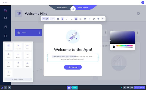
Product tours help familiarize new users with the interface, reducing the learning curve and enhancing user satisfaction by easing them into the experience without overwhelming them.
2. Preloaders
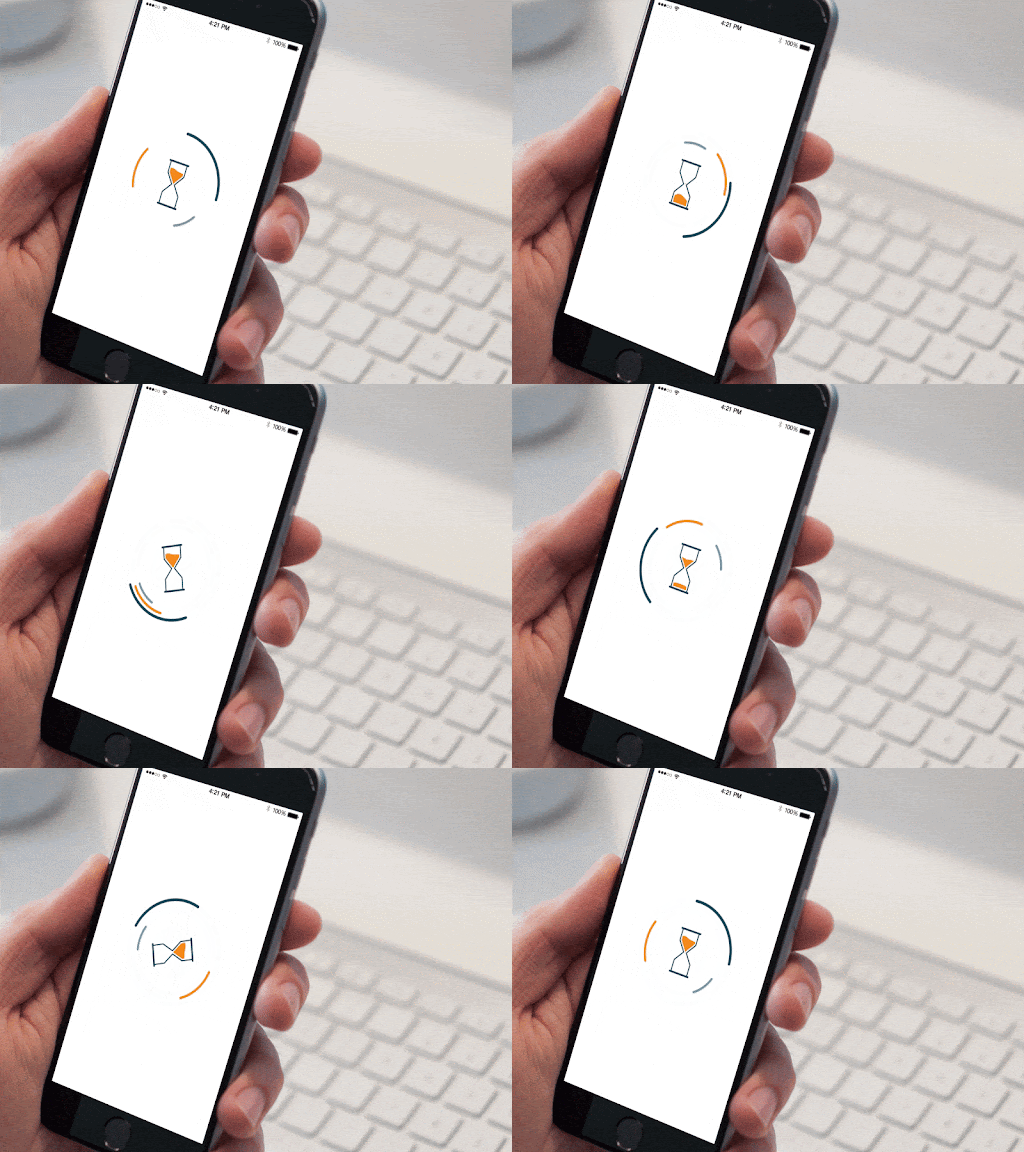
Preloaders, or loading animations, indicate that the application is processing or loading content. These can range from simple spinning circles to more elaborate animations that are consistent with the product’s branding.
Preloaders keep users informed about ongoing processes and help manage wait times by providing a visual indication that the system is active, which can reduce user frustration during delays. For instance, a video streaming app might show a film reel or clapper board animation while buffering content, engaging the user while they wait.
3. Animated call-to-action (CTA)
An animated CTA uses subtle animations on buttons or links to guide users toward taking action. Animations can include changes in color and size, icons that appear or animate, and shadow effects that make the button appear to lift or depress. For example, a Sign Up button might pulse gently or show a small animated arrow pointing at it, signaling users to click.
Animations like this draw attention to the CTA, increasing the likelihood of user interaction and enhancing the overall aesthetic appeal.

4. Input field validation
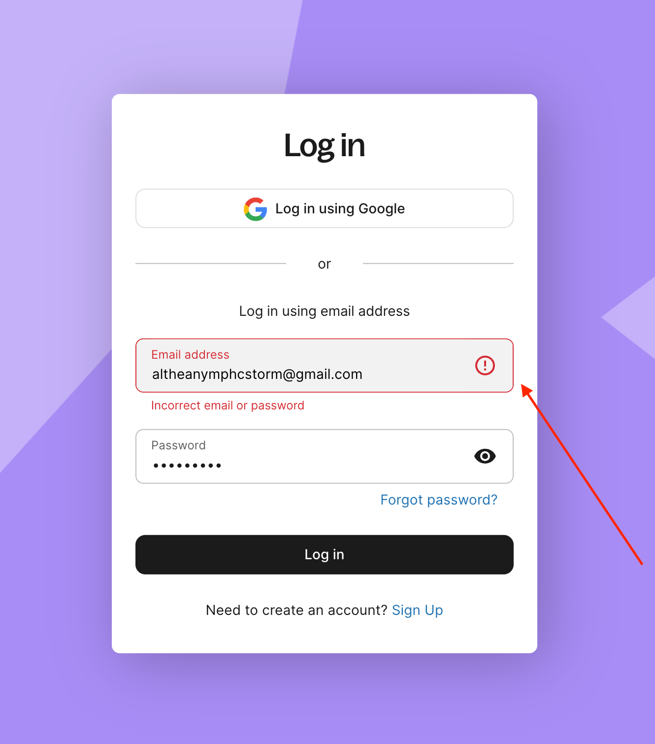
As users input data into a form field, real-time validation microinteractions can indicate whether the information they entered is valid or invalid. This could be through icons, changing border or background colors, or small popup messages. For instance, as you type an email address, a checkmark may appear if the format is correct, or a red border and an exclamation mark if it’s incorrect.
This microinteraction provides immediate feedback, helping users correct mistakes on the spot and streamlining the process of filling out forms.
5. Swipe actions
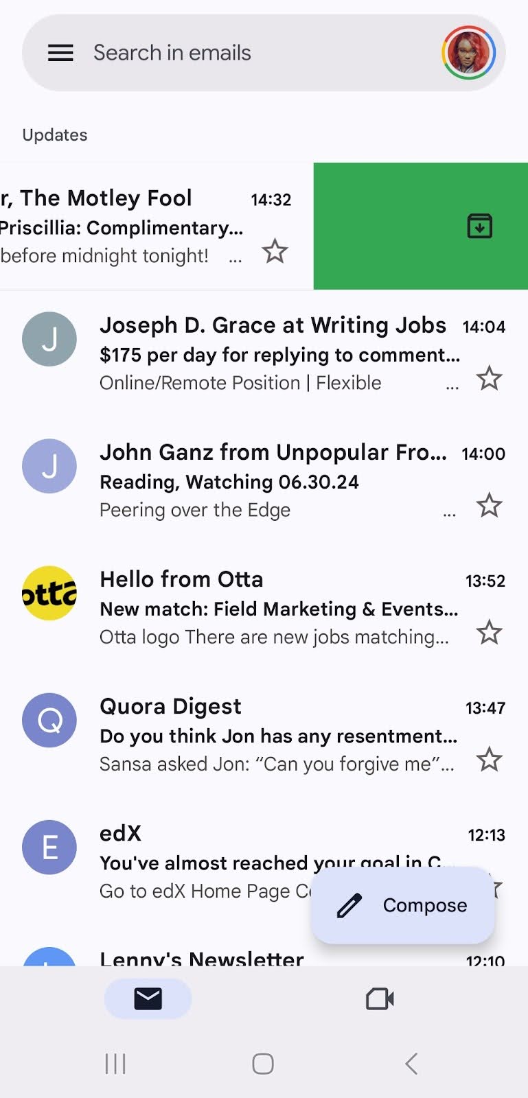
On touch interfaces, swipe actions provide interactive responses to horizontal or vertical gestures. This is often used in mobile apps, like Gmail, to delete/archive messages or reveal hidden menus. Swipe actions use the natural human interaction of swiping, making the user experience more engaging and efficient.
6. Toggle switches
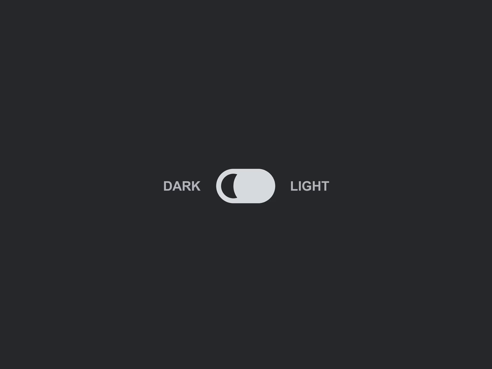
Toggle switches allow users to change settings between two states, such as turning options on or off. They usually provide immediate visual feedback, which is often accompanied by a satisfying click or similar sound effect.
In the settings menu, a toggle next to Dark Mode instantly changes the app’s theme from light to dark when flipped. Toggles make it easy for users to understand and control settings, clearly indicating whether an option is enabled.
7. Hover effects
Hover effects on web pages reveal additional information or options when a user places their cursor over an element. This can include color shifts, text changes, or the appearance of new icons or links. For instance, hovering over a portfolio image might darken the image and display the project name and a brief description.
These hover effects provide more context and interactive feedback without cluttering the interface, making it easier for users to navigate and understand their options.

Microinteractions best practices in UX design
- Keep it simple. The core purpose of a microinteraction is to improve an interaction without overwhelming the user. So, make sure your design is simple, and the function is clear. Avoid overly complex animations or interactions that confuse users or slow their experience.
- Provide immediate feedback. One of the key functions of microinteractions is to provide feedback. For instance, when a user performs an action like pressing a button, they should receive instant visual or tactile feedback to confirm that their action has been registered. This feedback can be as simple as a change in button color or a subtle vibration.
- Improve usability, not just aesthetics. While microinteractions can greatly enhance an application’s visual appeal, the primary goal should be to improve usability. Every microinteraction should serve a purpose, such as providing feedback, simplifying the user’s tasks, or reducing error rates.
- Be consistent. Consistency in microinteractions helps build a user’s intuition and confidence while using your product. The interactions should feel unified across the platform, following similar animation patterns, speeds, and styles. This consistency extends to how interactions are triggered and how they respond to user inputs.
- Use animation wisely. Animations are a common feature in microinteractions, but they should always serve a purpose. They should be fast enough to feel responsive but slow enough to be noticed. Avoid excessive and unnecessary animations that can distract or even annoy users.
- Design for accessibility. Ensure that your microinteractions don’t alienate or exclude users with disabilities. For example, when designing animations, consider users who are sensitive to motion. If possible, provide alternatives, such as the ability to reduce motion or replace certain interactions with more accessible options.
- Make it contextually appropriate. The design of microinteractions should be appropriate to the context in which they’re used. For instance, a playful loading animation may be suitable for a game app but not for a banking app where users might prefer straightforward and sober interactions.
- Optimize performance. Microinteractions should not adversely affect an application’s performance. They need to be lightweight and shouldn’t cause delays or increased loading times. Include performance testing as part of the design process to ensure that the interactions are as efficient as they are effective.
- Test for intuitiveness. Just because a microinteraction makes sense to you doesn’t mean it will be intuitive to your users. User testing is crucial to ensure that these elements are intuitive and improve the user experience. Observing real users as they interact with microinteractions can provide valuable insights into their effectiveness and areas for improvement.
- Iterate and evolve. Like all aspects of design, microinteractions can always be improved. Utilize analytics and user feedback to understand how your interactions are performing and make iterative improvements. What works well today might need adjustment as user expectations evolve and new interaction patterns emerge.
Elevate your user experience with Microinteractions
Microinteractions aren’t just minor embellishments you add onto an app or product hastily—they are pivotal elements that enrich user interfaces, making digital interactions feel more human and engaging. By focusing on these small details, you can dramatically improve the overall user experience by enhancing functionality, increasing user engagement, and subtly guiding user behavior.
That said, if you’re a SaaS company looking to increase your website’s visibility and ranking in search engine results pages (SERPs), get in touch with VH-info. VH-info is a SaaS link building agency that builds high-quality links for software companies and IT companies across several industries. Its services include keyword research, link profiles, site owner outreach for guest blogging opportunities, and link-building reports.
If you want to build an impressive backlink profile, send a message to VH-info today.


