
In the competitive world of SaaS (Software as a Service), effective communication is key to standing out. SaaS infographics have emerged as a powerful tool to simplify complex data, boost brand visibility, and drive user engagement.
This article explores the value of SaaS infographics, their benefits, challenges, and best practices while providing actionable insights for creating and promoting them effectively.
What is SaaS Infographic?
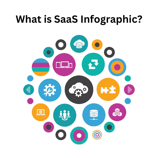
A SaaS infographic is a visual representation of information tailored specifically for SaaS companies. It combines design, data visualization, and concise text to communicate intricate concepts like cloud computing, scalability, or SaaS applications in an easily digestible format. These infographics are particularly useful for simplifying technical data related to SaaS products and public cloud services.
Why Do We Use Infographics in SaaS?
Infographics are indispensable in SaaS marketing because they transform complex ideas into visually engaging content that resonates with diverse audiences. Whether explaining the scalability of cloud services or showcasing the benefits of SaaS apps, infographics make data accessible and memorable.
Benefits of SaaS Infographics
Simplifying Complex Data
SaaS applications often deal with intricate concepts like cloud computing, scalability, and AI-driven tools. Infographics transform these complex ideas into easy-to-understand visuals using charts, icons, and diagrams.
For example, a SaaS company offering public cloud services can use an infographic to explain how their architecture optimizes scalability and ensures greater efficiency. This approach makes technical data more accessible to both experts and non-technical audiences alike.
Enhancing User Engagement
Infographics are inherently more captivating than plain text. They combine visually appealing elements with concise information, encouraging users to spend more time interacting with the content.
For SaaS companies, this means higher engagement rates on platforms like social media or blogs. Infographics also help communicate the value of SaaS products by presenting key benefits, such as improved SEO or streamlined workflows for SaaS apps, in an engaging way.
Boosting Brand Visibility
A well-designed infographic not only educates but also promotes brand recognition.
Including consistent color schemes, typography, and branding elements, SaaS companies can position themselves as industry leaders. Infographics are highly shareable across digital platforms, increasing the reach of your content and driving traffic back to your website.
For instance, showcasing how your SaaS product enhances cloud services or improves customer workflows can elevate your brand’s authority in the market.
Additionally, using a SaaS Link Building Service can amplify your reach by building high-quality backlinks that drive traffic and improve search engine rankings.
How to Create an Effective SaaS Infographic?

Creating a successful SaaS infographic requires thoughtful planning, a clear structure, and attention to design details.
Let’s break it down into three key steps:
Planning Your Content
Before you start designing, focus on the core message you want your SaaS infographic to convey.
Identify the most critical data points about your SaaS applications, cloud computing features, or scalability benefits. Organize this information logically, ensuring it aligns with your audience’s needs.
For example, if your target is SaaS companies, highlight how your SaaS products improve greater efficiency or SEO performance. Use reliable sources for data and avoid overloading the infographic with unnecessary details.
This step ensures that your infographic remains focused and delivers value.
Choosing the Right Layout
The layout of your infographic determines how easily users can follow the information.
Select a layout that suits the type of data you’re presenting—timelines for product evolution, comparison charts for SaaS apps, or statistical visuals for public cloud services. Use wireframes to plan the structure and ensure a logical flow.
For instance, if explaining AI integration in SaaS products, use a step-by-step layout to guide readers through the process. A clean and organized layout prevents confusion and keeps the focus on your key message.
Including Visual Hierarchy
Visual hierarchy is essential for guiding viewers’ attention through your infographic. Use size, color, and contrast to emphasize important elements like headings or key statistics about cloud services or SaaS applications.
For example, larger fonts can highlight benefits like scalability or consistency in SaaS products. Group related content using boxes or sections to maintain clarity.
Arranging elements strategically, you can ensure that viewers quickly grasp the most important points without feeling overwhelmed.
Why Creating SaaS Infographics Can Be Challenging?
Creating SaaS infographics comes with unique challenges due to the complexity of the SaaS industry and its data-driven nature.
One major hurdle is simplifying intricate concepts like cloud computing, scalability, or AI-driven SaaS applications into digestible visuals without losing essential details. Designers must ensure that the infographic communicates effectively while remaining visually appealing.
Another challenge is maintaining consistency in branding, such as using uniform color schemes and typography that align with the SaaS company’s identity. Additionally, presenting data accurately is important, as even minor errors can harm credibility. Balancing aesthetics with functionality is also tricky—infographics should look good but not overwhelm users with excessive information.
Lastly, creating infographics that are optimized for different platforms, such as social media or blogs, requires careful planning to ensure readability and accessibility across devices.
How to Promote Your SaaS Infographics?
Promoting SaaS infographics effectively involves strategic sharing and optimization to maximize their reach.
Start by choosing the right platforms where your target audience is active, such as LinkedIn for B2B SaaS companies or Twitter for tech-savvy users.
Optimize your infographic for SEO by including relevant keywords like “cloud services,” “scalability,” and “SaaS applications” in its title, description, and alt text to improve visibility on search engines.
For startups, using tailored strategies like SEO for Startup can help improve visibility, attract quality traffic, and maximize the impact of your infographic promotions. Add social sharing buttons to your website or blog post to encourage easy sharing across platforms.
Collaborate with influencers in the SaaS industry who can amplify your reach by sharing your infographic with their audience. Use email marketing campaigns to showcase your infographic in a visually appealing format and drive traffic back to your site. Additionally, embed codes can make it easier for others to share your infographic on their websites or blogs.
Finally, track performance metrics such as views, shares, and engagement using analytics tools to refine your promotion strategy over time.
Key Strategies For Effective SaaS Infographic Design

Focus On The Essential Message
The core of any SaaS infographic is its main message. Begin by identifying the most important point you want to communicate, such as the benefits of scalability in cloud computing or the efficiency of SaaS applications.
Avoid cramming too much information into one infographic—stick to one key idea or theme. For example, if showcasing how SaaS products improve SEO, focus only on relevant metrics and processes.
This clarity ensures that your audience can quickly grasp the information without feeling overwhelmed. Simplifying complex data into concise visuals helps make your infographic impactful and easy to understand.
Make It Visually Engaging Without Overwhelming
A visually appealing infographic grabs attention but should not confuse viewers with excessive elements. Use clean designs, consistent color schemes, and readable typography to maintain balance.
For instance, when explaining public cloud services, use icons and charts to highlight key points instead of long paragraphs. Include white space strategically to give the design breathing room and avoid clutter.
Tools like Canva or Adobe Illustrator can help create polished visuals that present data attractively while keeping it simple. Remember, an effective infographic is one that looks great but also communicates clearly.
Ensure It Aligns With Your Brand
Consistency with your brand identity is important for building trust and recognition. Use your brand’s color palette, fonts, and logo in the infographic design to reinforce familiarity.
For SaaS companies, this could mean using colors that reflect your cloud services or SaaS apps’ themes while ensuring typography matches your website or other marketing materials.
Aligning with your brand ensures that the infographic not only educates but also strengthens your company’s image.
For example, a SaaS company emphasizing AI-driven solutions can use futuristic design elements that resonate with their innovative positioning. This approach ties the visual content back to your overall branding strategy effectively.
How Effective SaaS Infographics Works?
SaaS infographics are powerful tools that simplify complex data and make it visually appealing, helping SaaS companies communicate effectively with their audience.
They work by condensing intricate concepts like cloud computing, scalability, or AI-driven SaaS applications into easy-to-understand visuals such as charts, graphs, and diagrams. This makes technical information more accessible to both technical and non-technical users.
Infographics capture attention quickly with their visual appeal, keeping viewers engaged longer compared to plain text.
For SaaS companies, this means better communication of features like public cloud services or SaaS apps’ benefits. They also enhance understanding and retention by presenting data in a structured, logical format.
Moreover, SaaS infographics boost brand visibility by being highly shareable on social media and other platforms.
Their SEO-friendly nature allows the inclusion of keywords like “cloud services” or “infographic template,” which improves search engine rankings and drives traffic.
Types of SaaS Infographics
Comparison Infographics
Comparison infographics are designed to highlight the differences and similarities between SaaS products, services, or features.
These visuals are especially useful for SaaS companies to help prospects make informed decisions by comparing key aspects like pricing, scalability, or performance of cloud services.
For example, a SaaS company could use a comparison infographic to showcase how their SaaS applications outperform competitors in terms of greater efficiency or AI integration.
Timeline Infographics
Timeline infographics are perfect for showcasing the evolution of a SaaS product, company milestones, or the development stages of cloud computing solutions. They visually map out events in chronological order, making it easier for audiences to understand progress over time.
For instance, a SaaS company could use a timeline infographic to demonstrate how their public cloud services have scaled over the years or how their SaaS apps have integrated advanced AI features.
These infographics not only tell a story but also build credibility by showing consistent growth and innovation.
Statistical Data Visualizations
Statistical data visualizations focus on presenting numbers and metrics in an engaging and digestible way.
They are ideal for showcasing key performance indicators (KPIs) like user adoption rates, customer retention, or the impact of SaaS products on SEO. By using charts, graphs, and icons, these infographics make complex data easier to interpret.
For example, a SaaS company could create a statistical infographic to highlight how their cloud services improve scalability and reduce costs for clients. These visuals help communicate data-driven insights effectively while supporting informed decision-making for stakeholders.
Best Practices For SaaS Infographic Design

To make your SaaS infographic more powerful and effective, it’s important to follow design best practices.
Balancing Visual Elements
Balancing visual elements ensures your SaaS infographic looks organized and appealing. Use a mix of colors, shapes, and text to create harmony without overwhelming the viewer.
For example, when presenting data about cloud services or SaaS applications, distribute visuals like icons and graphs evenly across the design. Include white space to give the content breathing room and avoid clutter.
Whether using symmetrical balance (equal weight on both sides) or asymmetrical balance (dynamic placement), the goal is to guide the viewer’s eye naturally through the infographic. A balanced design helps communicate your message clearly while maintaining visual interest.
Ensuring Readability
Readability is important for making your SaaS infographic effective. Use clean, standard fonts instead of decorative ones to ensure text is easy to read.
Adjust line spacing and font sizes appropriately, especially when explaining technical concepts like scalability or AI-driven SaaS products. Avoid overcrowding text; instead, break information into small sections with headings and bullet points.
For example, when detailing SEO benefits of SaaS apps, use concise phrases supported by visuals like charts or icons. Ensuring readability makes it easier for audiences to quickly understand complex data without feeling overwhelmed.
Using Consistent Color Schemes and Typography
Consistency in color schemes and typography strengthens your brand identity and makes your infographic more professional. Stick to your brand’s colors and fonts across all infographics to maintain familiarity with your audience.
For instance, if your SaaS company focuses on public cloud services, use colors that reflect trust and innovation, such as blues or greens. Limit the number of colors used—typically two or three main colors with accents for emphasis.
Consistent typography ensures uniformity in headings, subheadings, and body text, helping viewers focus on the content rather than the design inconsistencies. This approach builds trust and reinforces your brand’s credibility.
Tools For Designing SaaS Infographics

- Canva: Canva is a popular and user-friendly tool for creating visually appealing SaaS infographics. It offers a vast library of infographic templates, icons, and images that can be easily customized to fit your brand. With drag-and-drop functionality, even beginners can design professional-looking infographics that showcase SaaS applications, cloud services, or scalability benefits. Canva also supports collaboration, allowing teams to work on designs in real time. Its free plan is great for basic needs, while paid plans unlock advanced features like custom fonts and branding options.
- Venngage: Venngage specializes in infographic creation with over 100 customizable templates tailored for different data types, such as comparison charts or statistical visuals. This tool is ideal for SaaS companies looking to present complex data like AI-driven SaaS products or SEO metrics in an engaging way. Venngage allows users to add text, images, and charts seamlessly while maintaining consistency with their brand colors and typography. It’s suitable for both beginners and professionals, with pricing plans ranging from free to premium.
- Piktochart: Piktochart is another excellent tool for designing SaaS infographics, offering a clean interface and a variety of templates for timelines, reports, and more. It’s particularly useful for visualizing data about SaaS apps or public cloud services with its drag-and-drop editor and access to a library of icons and images. Piktochart’s features include interactive maps and resizable canvases, making it versatile for different infographic types. Paid plans provide additional customization options like uploading custom fonts and removing watermarks.
- Visme: Visme is a powerful design tool that combines infographic creation with advanced data visualization features. It allows SaaS companies to create interactive infographics by integrating live data from sources like Google Sheets. This makes it perfect for presenting real-time metrics about SaaS products or cloud computing performance. Visme also supports animations and effects to make infographics more dynamic. With its free plan and affordable paid options, it’s suitable for businesses of all sizes.
- Infogram: Infogram is ideal for creating data-driven SaaS infographics focused on statistics or KPIs like user adoption rates or scalability improvements. It offers templates specifically designed for charts, graphs, and maps, making it easy to turn complex data into engaging visuals. Infogram’s standout feature is its ability to connect with live data sources, ensuring your infographic stays up-to-date. The tool also provides sharing options like embedding on websites or exporting as high-quality images.
Examples of Successful SaaS Infographics
- HubSpot’s Marketing Metrics Infographic: HubSpot created an infographic showcasing key marketing statistics relevant to SaaS companies. It used clean visuals and concise text to explain how their tools improve SEO and customer engagement. This example highlights the importance of presenting data in a structured format that resonates with the audience.
- Dropbox’s Cloud Security Overview: Dropbox designed an infographic to explain the security features of their cloud services. By using icons and simple diagrams, they effectively communicated complex technical details about encryption and scalability without overwhelming viewers.
- Slack’s Productivity Benefits Infographic: Slack used an infographic to demonstrate how their SaaS app enhances team productivity through integrations with other tools and streamlined communication workflows. The design emphasized key benefits like greater efficiency using bold headings and visual hierarchy.
- Zapier’s Automation Workflow Infographic: Zapier created an infographic illustrating how their automation workflows simplify repetitive tasks across various SaaS applications. They used flowcharts and step-by-step visuals to make the process easy to understand while reinforcing their brand identity.
- MailChimp’s Year in Review Infographic: MailChimp shared an annual infographic summarizing user statistics like email campaigns sent and open rates achieved through their platform. The design combined engaging visuals with statistical data to showcase their impact on businesses using their SaaS products effectively.
FAQ’s:
What’s The Best Format For a SaaS Infographic?
The best format for a SaaS infographic is typically vertical, as it allows for logical flow and is easy to scroll through on digital platforms.
This format works well for presenting data like SaaS applications’ benefits, cloud services, or scalability metrics. Ensure the infographic is optimized for web use, with dimensions around 800 pixels wide and adjustable lengths to fit the content.
A clean design with sections for headings, visuals, and concise text makes it more effective and shareable.
How Long Should a SaaS Infographic Be?
A SaaS infographic should be long enough to convey its message but not so lengthy that it overwhelms viewers. Ideally, keep it under 2,000 pixels in height to maintain readability and engagement.
For example, if you’re showcasing SaaS products or public cloud services, focus on key points like greater efficiency or SEO benefits without adding unnecessary details. Shorter infographics are more likely to retain attention and be shared across platforms.
How Can I Measure the Success Of My SaaS Infographic?
The success of a SaaS infographic can be measured using metrics like website traffic, social media shares, and engagement rates. Tools like Google Analytics can track how many users view or interact with the infographic on your site.
Additionally, monitor SEO performance by checking if keywords like “cloud computing” or “infographic template” drive organic traffic. High shares and backlinks indicate that your infographic resonates with your audience and boosts brand visibility.
Should I Use Animations in SaaS Infographics?
Animations can enhance a SaaS infographic by making it more dynamic and engaging, especially when explaining complex concepts like AI or scalability in cloud services.
However, use animations sparingly to avoid distracting viewers from the main message.
For example, subtle hover effects or animated charts can highlight key benefits of SaaS apps while keeping the design professional. Ensure animations are compatible across devices for better accessibility.
What Makes an Infographic Successful in the SaaS Industry?
A successful SaaS infographic combines clarity, relevance, and visual appeal. It simplifies complex data about topics like public cloud services or SaaS applications into digestible visuals while aligning with your brand identity.
Consistent color schemes, readable typography, and strategic use of icons or charts make it visually attractive. Additionally, focusing on one main idea—such as scalability or SEO improvements—ensures the infographic is easy to understand and shareable across platforms.
Conclusion
SaaS infographics are a powerful way for SaaS companies to communicate complex ideas like cloud computing, scalability, and AI-driven solutions in a simple and engaging format.
They help break down intricate data into visually appealing content, boosting user engagement and improving brand visibility.
Following best practices such as balancing visual elements, ensuring readability, and maintaining consistency in design can help SaaS companies create infographics that resonate with their audience.
Tools like Canva, Venngage, and Visme make it easier to design professional infographics tailored to SaaS applications and public cloud services. When promoted effectively through SEO optimization and social sharing, these infographics can drive greater efficiency in marketing efforts and establish your brand as an industry leader.
With the right strategies, SaaS infographics can be a valuable asset for educating audiences and showcasing the unique value of your SaaS products.

 Share
Share