Wireframe vs Mockup vs Prototype: The Ultimate Comparison
Upon thinking about developing a new app, there are two things that you need to take good care of: functionality and design. Both aspects are truly what make an app. Do you have good functionalities and a good design? You have a great and successful app. Do you have poor functionalities and design? You have a low-quality app. It is how it works. Let us emphasize one of the two aspects, which is designing an app. Designing an app is a very precise process that usually takes a lot of time and a bunch of trials and errors. To visualize their ideas and validate how well they can perform, developers usually use one of three practices: wireframe, mockup, or prototype. In this article, we will establish a great comparison of wireframe vs. mockup vs. prototype to help you decide which is better for you during the app design phase.
What is an App Wireframe
 The first step in the wireframe vs mockup vs prototype comparison is to understand wireframing. A wireframe is the first step in designing, or, to be more specific, outlining, the practice of an app. What a developer or a UI/UX designer tends to do is validate the app concept by turning all the ideas that they conducted in the beginning into an actual and initial product
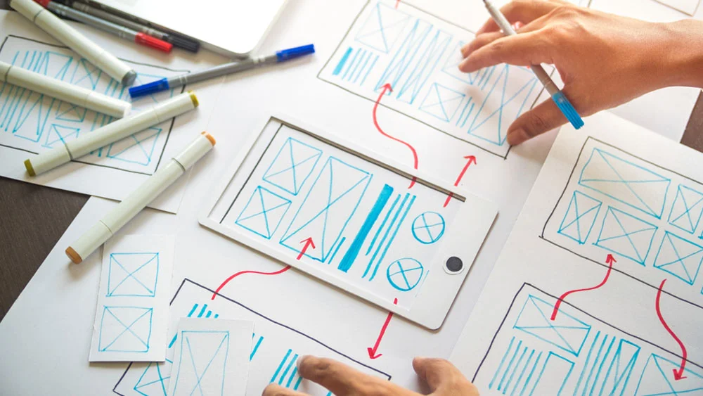
Wireframing is sketching or outlining an app to emphasize all the sections and elements included in it. It represents the concepts, features, layout, and graphics. However, it is important to keep in mind that wireframing is not extravagant at all, it is the complete opposite. It is always simple and minimal, as it tends to present only the initial concept and nothing more. You can create wireframes digitally or by hand. Wireframing has three types which are;
Types of Wireframe
Low-Fidelity
The first one is low-fidelity, or lo-fi. And based on the name, it is the simplest and most minimal type of them all. Lo-fi is a very basic presentation of the whole app design. As the purpose behind low-fidelity wireframing is just to visualize an idea, it doesn’t have to be precise and accurate in terms of sizes, grids, and scales.
Mid-Fidelity
The second type is mid-fidelity. Mid-fidelity wireframing is more advanced than low-fidelity. We can now integrate and insert some additional elements and visualizations into the layout. However, we also need to stick to the basics and avoid too much clutter and visuals.
High-Fidelity
Lastly, comes the ultimate type of wireframing technique, which is high-fidelity. With high fidelity, we now have the chance to express and represent the app idea better. Visualize all the features and components and describe each and every concept. Designers can include images and even content.
What is an App Mockup
 A mobile app mockup comes right in between prototyping and wireframing. In terms of functions, it is not as interactive as prototyping, but also not as basic as wireframing. A mobile app mockup is an exact replica of an app. It is the process of turning an app idea into a tangible product with all the functions, sections, layout, colors, and graphics. You might think that this is exactly what a mobile app wireframe does, so what is the difference?
Besides the key differences, which we are going to mention later, wireframing and mockups differ significantly. Mockups are not by any means basic or initial, they are an exact representation of an app. Which means that sketching is not for them. They contain all the UI designing and elements that the wireframe usually lacks like colors, fonts, icons, photos, etc. It is exactly the same as designing a 3D model of a building to see how it would look in real life. Just like Wireframing, Mobile app mockup has three types which are;
Types of Mockup
Static Mockups
Static mockups are app screens that showcase all the key features of the app. These key features are usually described using visual elements that imitate the final form of the app. These screens are just images, as they are not interactive at all, and are just to present a glimpse of the app in development.
Scrollable Mockups
A more interactive type of mockup is the scrollable mockup. Scrollable mockups showcase the whole app and app screens in a vertical way that a user can scroll through. These types of mockup generator tools are ideal, especially for emphasizing social media app features that include a timeline or a newsfeed. In addition to representing the app, it gives a peek at the app’s navigation and behavior.
Animated Mockups
Animated mockups are the closest type to an interactive prototype. This type of mockup includes every element and section that are featured in the static mockups. However, designers get to add a little bit of spice. UI/UX designers get to include animated visuals, motions, and transitions that make the mockup more lively, dynamic, and engaging.
What is an App Prototype
 Here comes the ultimate type of UI/UX design: mobile app prototyping. Mobile app prototyping is the ideal technique to visualize your app idea, as it has the best of both worlds. It includes representing all your app’s features, elements, and layout while also adding both visuals and interactivity. Interactivity is definitely what makes mobile app prototyping special. Developers, investors, and users interested in the app get to view all the perspectives and complete structure of the app and also experience them. Despite its notoriety as an interactive process, many types of mobile app prototyping don’t include interactive elements. So, let us break down the five types of prototyping which are;
Types of Prototype
Sketching and Diagrams
Drawings and sketches are the first step in the prototyping process. The process of initial planning and brainstorming is usually where developers create sketches and diagrams. With this approach, the UI/UX designer and developers first sketch an initial layout of the app, including all the screens and key features they intend to add. These sketches don’t abide by any scales or specific measurements; they are usually conducted in a random and quick way.
Paper Prototype
Paper prototyping is a more structured approach to sketches. It is conducted in order to demonstrate the app’s concept and design in greater detail. You can actually say that paper prototyping is kind of dependent on sketches and diagrams. As app designers and developers, we would combine all of the initial ideas and sketches from the brainstorming process and present them properly on paper, elaborating on them and giving them greater depth and detail in the process. Each screen and feature included in the app would be laid out in detail on its own sheet of paper.
Low-Fidelity Prototype
Now that we can finally depend on digitalization, we can conduct low-fidelity prototyping. The low-fidelity prototype is probably one of the earliest forms of digital prototyping. All the features and sections of the app will be presented digitally in a basic, monochrome version. In spite of being digitally executed, the low-fidelity prototype still misses aesthetics, visually appealing elements, and in-depth details. they are often designed to get an initial response from users and potential funders and investors
Medium-Fidelity Prototype
An even improved version of prototyping is the medium-fidelity version. In contrast to the low-fidelity layout, this type has a lot more depth, richness, and elements to add. Visuals, such as buttons, icons, and illustrations, can now be included within the prototype, as many as the developers want. However, the lack of interactivity is the only major disadvantage of the medium-fidelity prototype.
High Fidelity Prototype
In the wireframe vs mockup vs prototype comparison, we have to mention high-fidelity prototyping. We have reached what we believe to be the most detailed and comprehensive prototype of an app. You can’t obtain a more accurate representation of an app than a high-fidelity prototype. The process of conducting a high-fidelity prototype is identical to that of a real app. It includes all the visuals, interfaces, features, icons, and buttons that the finished product will have. Users can even participate in and obtain insights from the experience.
Wireframe vs mockup vs Prototype: The key differences
Purpose
Each of the wireframes, mockups, and prototypes plays a unique role in the design process. Wireframes are low-fidelity, conceptual representations that highlight the structure and functionality of a design. Mockups are more advanced, detailed representations that also include visual design. Prototypes are functional and interactive models of a design that users can interact with and review There is a progression and transition from wireframes through mockups to prototypes, with each step adding to the one before it.
Product Cycle Stage
At every level of the product life cycle, it is essential to have a clear understanding of the differences between wireframe vs mockup vs prototype. Mockups are conducted during the design phase, while wireframes are usually conducted during the planning and ideation phases. However, at the final design and testing phase, developers develop prototypes to get feedback and make adjustments before releasing the final app.
Tools
In the wireframe vs mockup vs prototype comparison, we have to mention tools. All three can be made with a variety of different tools. Wireframing software and tool options range from UXPin, Sketch, and Figma to Adobe XD. Tools like MockPlus, and Mockflow are commonly among the best tools for creating mockups. For prototyping, developers usually use tools like Webflow, Proto.io, and Axure. To get the best outcomes, it’s important to use the appropriate tool at each stage of the design process.
Read More : Top 10 copy ai alternatives tools
Elements
The elements included are also a major thing that sets wireframes, mockups, and prototyping apart. A wireframe is an easy-to-understand and convenient representation of a mobile app’s structure and features. This means that the elements included are limited to the basics, such as menu bars, sections, and buttons. Since its primary purpose is to illustrate the design’s aesthetics rather than its structure, prototyping includes all the visuals and elements absent in both wireframes and mockups. And in contrast to wireframes, they are not rendered in grayscale; it is important that they are colorful and full of life.
Raj Panchotiya
Raj Panchotiya is a Head of link-building projects at vh-info. He loves to talk about Marketing and Social media. In his free time, he likes to read & stay updated on the marketing!
You can always reach out to Raj on LinkedIn.


